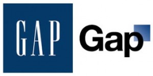
Heard about the new logo that Gap rolled out last week? The logo was quickly met with an unexpected backlash from both consumers and graphic designers alike. A blog and tweet avalanche of complaints flooded the web, all seeming to bash the rebranding. Only four days after going public with its hot new squeeze, the company dumped the fresh symbol and reverted to its old one.
According to Gap president Marka Hansen, the logo redesign was a step toward the future.
“We chose this design as it’s more contemporary and current. It honors our heritage through the blue box while still taking it forward.”
It seems that Gap Corporate wanted to rebrand the company and update its look from a “classic, American” feel to a “modern, sexy, and cool” design.
 Gap is trying to evolve with the times and its consumers, so a logo change is necessary—depending on who you talk to. And you have to admit, the new logo is indeed contemporary. However, there is nothing cool or sexy about it, especially the font choice. Helvetica is one of the most overused fonts out there, although very current, and is a staple font for most corporations. It projects a serious and professional tone—a tone that is a bit inappropriate for a clothing brand, especially Gap.
The new, smaller blue box is placed in the upper right corner of GAP, seems to randomly float in space, unanchored, and makes the logo look a bit awkward. The gradient is something you would expect to see in a software firm’s logo, giving off more of a technology feel.
Regardless of Gap’s pulling the logo too soon or not, people are always resistant to change. Even if the logo was perfect it wouldn’t satisfy everyone. Whether it’s a Facebook layout redesign, a computer operating system upgrade, or a new significant other, they all take time getting used to. You usually don’t love anything intensely at first—they have to grow on you. That’s just the way it is.
The logo may not have been the most favorable or best design, but now we’ll never really know for sure. The design firm and Gap should go back to the drawing board, re-imagine the logo, perhaps with more input from their customers, and do what they feel is best for the brand, not what the critics think. The most innovative things ever created usually intimidate most people at first—like the airplane. So as Gap moves on from this fiasco, they should remember two things, “You can’t be everything to everyone” and “If you aren’t evolving, you’re dying.”


