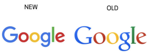
Google introduced a new logo on Tuesday in what it says is its biggest redesign since 1999.
Making the announcement in a blog post, Google’s homepage also introduced the redesign with an animation that wiped away the old logo and drew the new one.
The company said the redesign, which includes a sans-serif font and a slightly toned-down four-color piece, was meant to reflect the way that people interact with Google products across many different platforms, apps, and devices.
The logo has undergone many, mainly small, changes in its history. The colors have changed, 3D letters have been flattened, and an exclamation point came and went in 1999. Google said the new design would soon be seen across all its products.
While the new logo’s redesign doesn’t seem that major, it reportedly is just one step of many as Google changes its culture and branding.
The move comes just a month after a major restructuring of the company was unveiled. Google is now owned by Alphabet, a holding company created to separate the money-making search engine company from the loss-making projects like robot cars.
See all the creative Google Doodles designed over the years for different holidays, birthdays, anniversaries, and events.


